
Tips for Building the Perfect Palette for Your Home.
Shades, Tints & Tones: The Simple Colour Secrets Every Home Decorator Should Know
When you’re choosing paint, fabrics or finishes, the colour names can be confusing. Even though “blue” seems straightforward, there are hundreds of versions of it — soft, bright, dark, muted. This is where shades, tints and tones come in. Understanding these three words helps you pick colours that work beautifully together and give your interior space the mood you want.
What They Actually Mean (No Design Degree Needed)
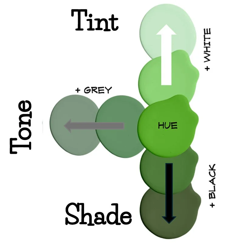
Hue: This is just the basic colour itself — red, blue, green, yellow.
Tint: A tint is what happens when you add white to a colour. It makes it lighter and softer. Think pastel blue or blush pink.
Shade: A shade is created by adding black to a colour. It makes it darker, richer and moodier — like navy or forest green.
Tone: A tone is when you add grey to a colour. It softens the brightness without making it dark. This is how you get those “dusty” or “muted” colours that feel calm and sophisticated.
Why This Matters in Real Homes
When you know the difference between a shade, tint and tone, you start to see how colours relate to each other. Instead of picking random swatches, you can plan a palette that actually works.
Creating a Mood:
Lighter tints make rooms feel airy and open.
Darker shades create drama and cosiness.
Toned colours give you that “grown-up” muted feel that’s easy to live with.
Balancing Spaces: If you have a dark sofa, adding tinted or toned cushions helps it not feel heavy. A very bright room? A few shaded accents can add depth.
Mixing and Matching: Once you understand tones, it’s easier to mix different colours without clashing.
How to Choose the Perfect Palette
Choosing a colour palette for your interior space can feel overwhelming, but here’s a simple roadmap to make it easier:
Start With What You Love
Think about a colour that always draws you in — it could be from your wardrobe, a favourite artwork, or a photo from your travels. This becomes your anchor hue.
Build Around a Hero Colour
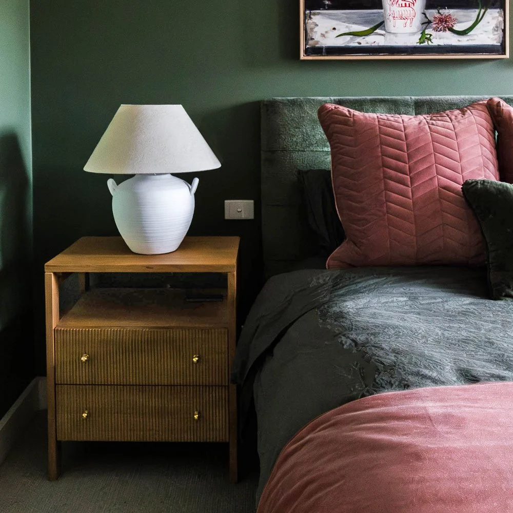
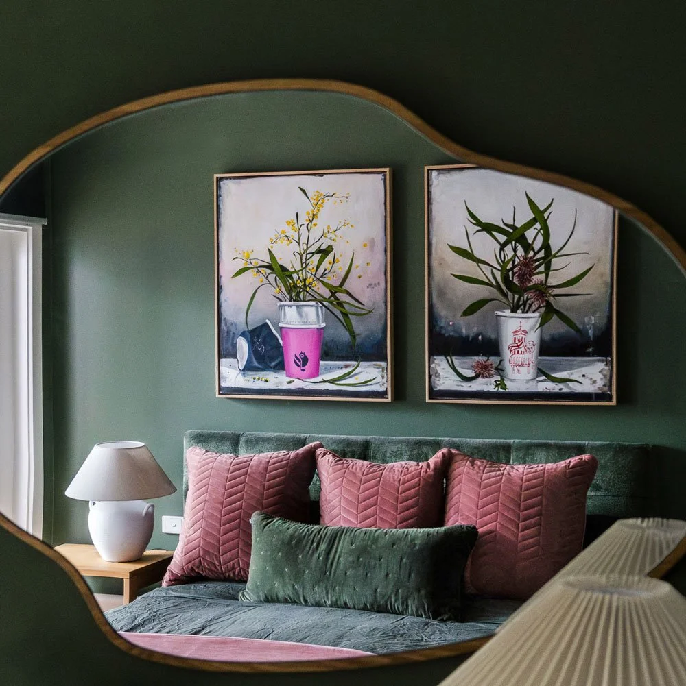
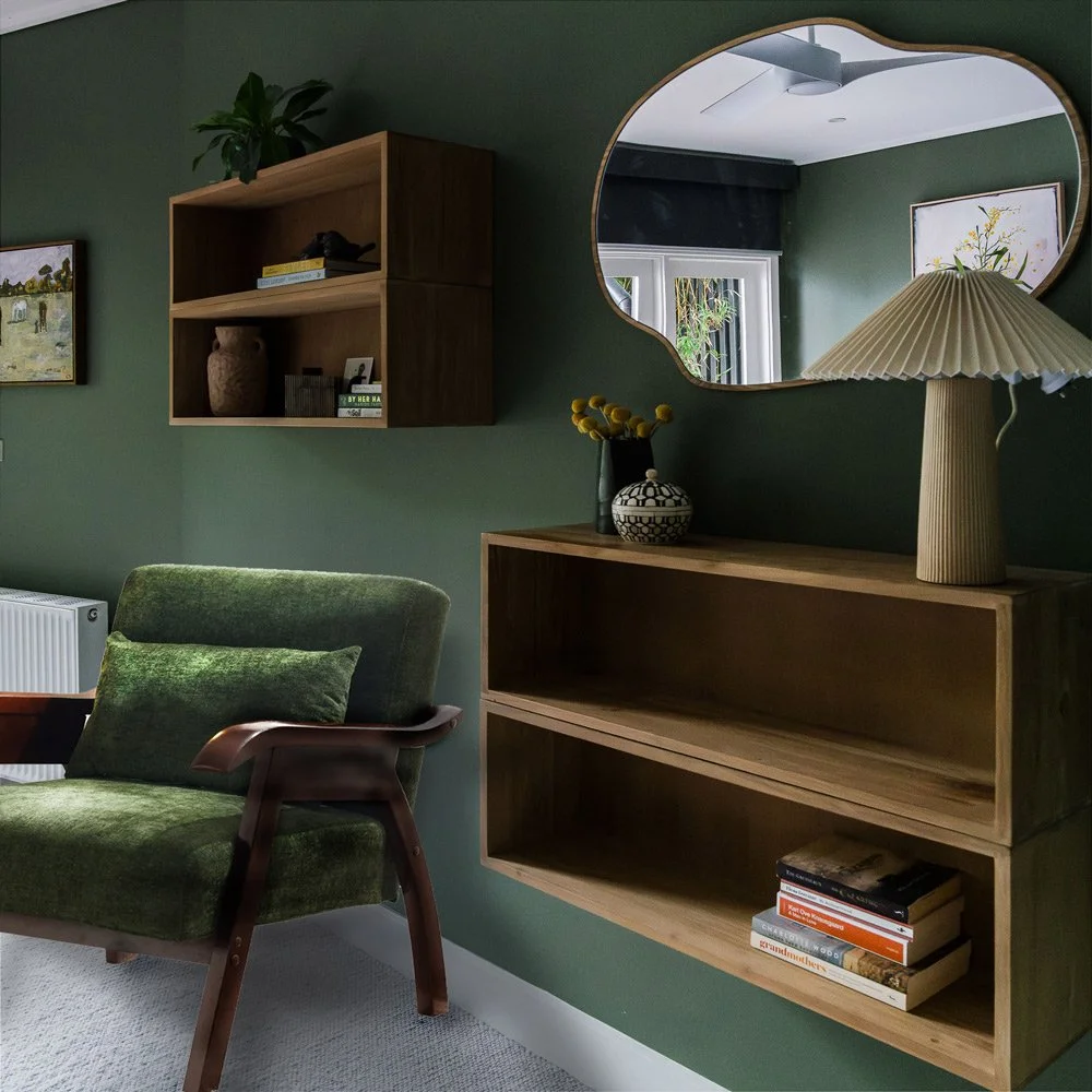
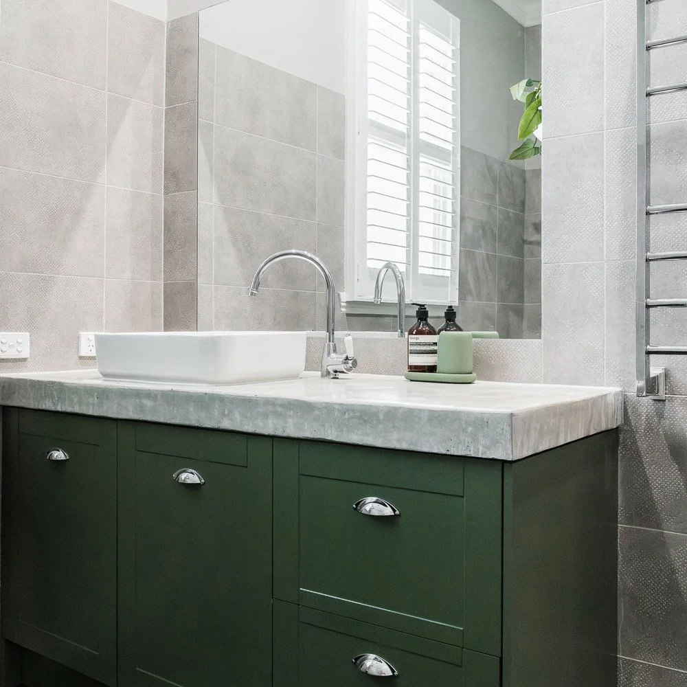
Take your anchor hue and explore its tints, shades and tones. For example, if your hero colour is green, you might use a pale mint on walls (tint), a deep olive sofa (shade), and a muted sage rug (tone).
Stick to 3–5 Colours Per Space
A simple rule of thumb is a primary colour, a secondary colour, and one or two accent colours. This creates balance and variety without feeling chaotic.
Consider Light & Room Function
Some rooms benefit from softer tints and muted tones; some spaces can handle darker shades or stronger accents.
Test Swatches in Real Life
Always view paint samples or fabric swatches in your actual room at different times of day. Watch them when light hits the colour and when it’s in shade. Natural and artificial light dramatically change how colours appear.
Link Rooms With Subtle Repeats
If you love continuity, use one tone or accent throughout your interior space to tie rooms together—for instance, the same muted blue across different fabrics or accessories. You don’t need to be an interior designer to use colour like an interior designer. By understanding shades, tints and tones — and how to build a palette from them — you’ll choose colours with more confidence and create interior spaces that feel intentional rather than accidental.
Do need help building a palette for your next project?
Contact Us and we’ll help you translate these colour tricks into a home you love.